NTUMODS: Reimagining the Academic Planning Experience for 30,000+ Students
I led the design of NTUMODS' timetable planning experience, helping NTU students compare indexes faster, recover from clashes safely, and coordinate with friends through built-in sharing + calendar export. These features are positioned as first-class actions to match real STARS behavior.
Role
UI/UX Designer
Timeline
2 months (Dec 2023 - Jan 2024)
What I Worked On
Timetable usability improvements around saving, flexible schedule selection, sharing, exporting, and customization
Teams Involved
Student-run, cross-functional team (8 Devs, 1 PM, 4 Designers)
NTUMODS: making semester planning faster
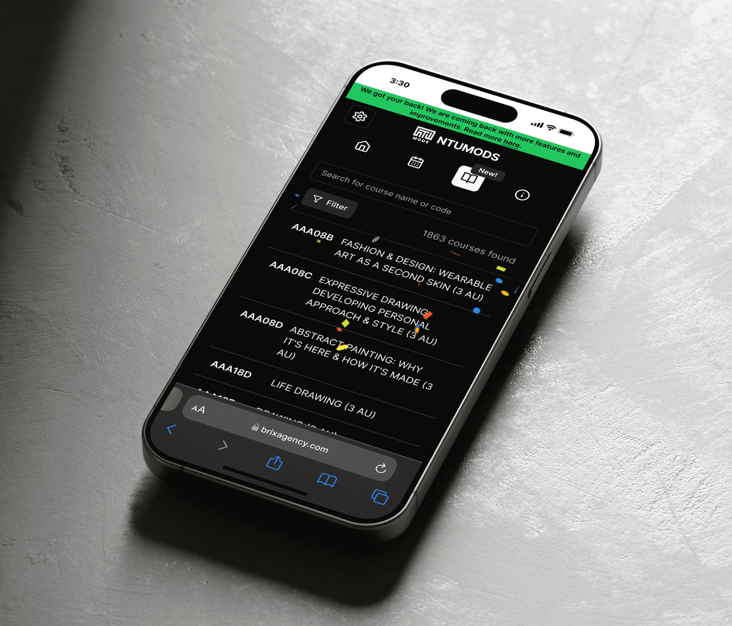
NTUMODS is a student-run timetable planner built for NTU students, helping them explore module indexes, resolve clashes, and coordinate schedules with friends through a fast, grid-first experience—combining flexible index switching, shareable timetables, and calendar export so planning goes from “what-ifs” to a real weekly routine in minutes.

What's the problem?
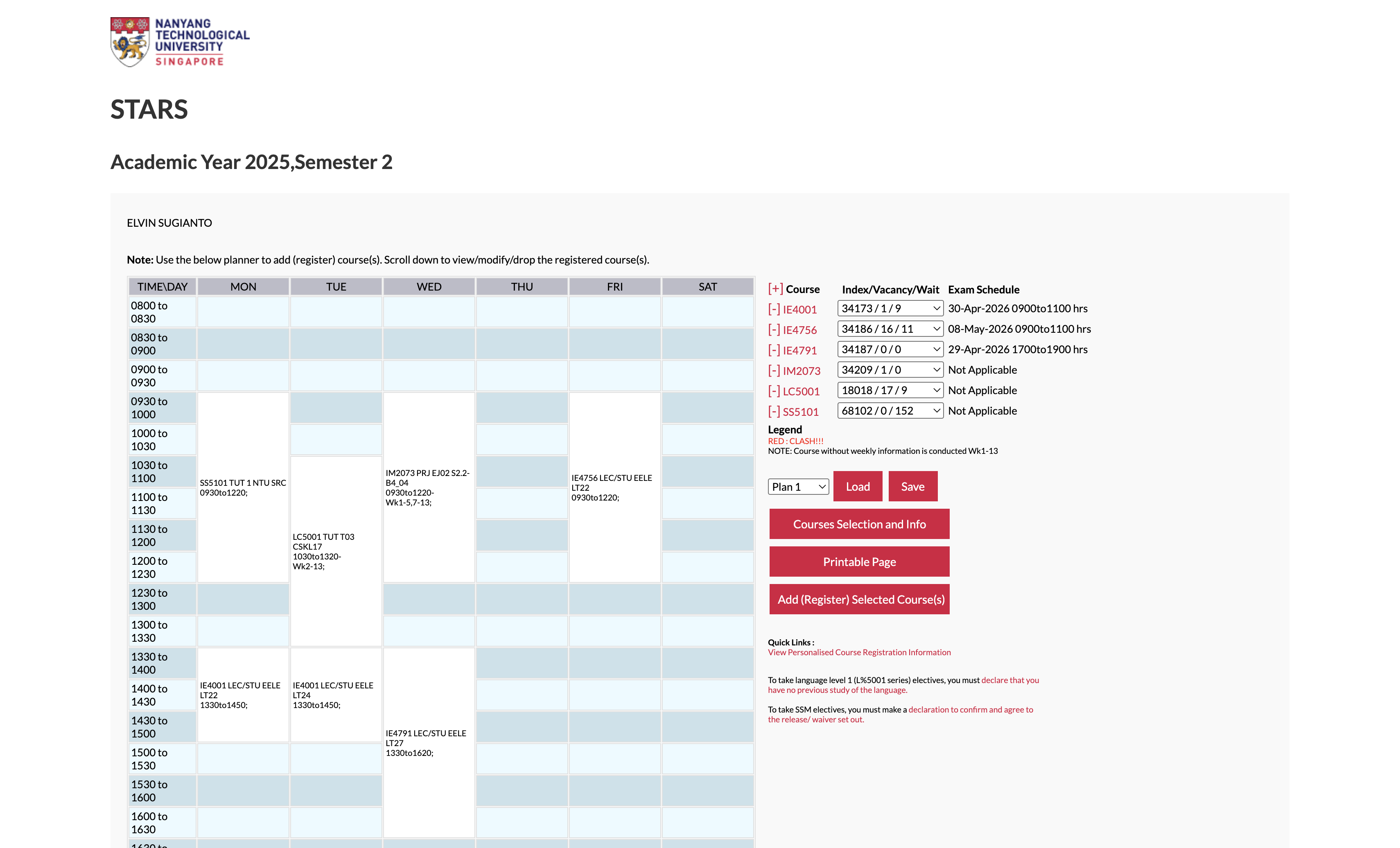
While NTU students try to plan their timetables during STARS Wars, they don't have an efficient way to compare module options, resolve clashes, and coordinate with friends in a single, smooth flow.
So, the challenge becomes...
How might we help students quickly build and adjust a conflict-free timetable—while making it effortless to save, share with friends, and export to their calendar?
and... what's the outcome
Outcome
I led the design of NTUMODS' planning experience so students could compare indexes faster, recover from clashes safely, and coordinate with friends through built-in sharing + calendar export. These features are positioned as first-class actions ('Share this plan', 'Export to Calendar File') to match real STARS behavior.
Why this project existed
It all started with a shared irritation within my own friend grousp. Every semester, 'STARS Wars' (our course registration period) felt less like academic planning and more like a battle against the interface.
But as a designer, I knew our frustration wasn't data.
Problem Validation: Understanding Students' Needs
We conducted user interviews with 15 students across different faculties, and we uncovered...
What students struggled with
Comparing schedules across modules was overly complicated
'What-if' planning required too many steps, making index exploration slow and frustrating.
The 'Telegram' Back-and-Forth
Without a clean way to share a plan, students rely on chat back-and-forth ('free Tue 2pm?'), which creates misalignment.
Visual Fatigue
Long planning sessions + weak hierarchy made it hard to quickly scan the class schedule, especially when it comes to lectures vs. tutorials.
What students expected instead
Compare at a glance
See the week clearly; clashes should be obvious immediately.
Built for social planning
A timetable isn't final until friends agree.
Fast integrations with calendar apps
Export must be easy to integrate with calendar apps, or the plan becomes useless.
Product Goals
I framed the work around 4 outcomes:
01
Speed
Reduce the time it takes to explore and compare schedule options.
02
Control
Let students adjust indexes confidently (without 'breaking' their timetable).
03
Shareability
Make it easy to send a plan to friends (no screenshots-as-a-workflow).
04
Portability
Make calendar export feel 'done in seconds.'
Design Principles
When trade-offs came up, I used these principles to stay consistent:
Fluid Interactivity
A flex-first grid that updates instantly to surface clashes and viable alternatives—no mental juggling needed.
Social Continuity
Designed for 'my schedule' → 'our schedule,' with easy sharing and calendar export into tools like Google Calendar.
Clarity over Clutter
Strong visual hierarchy so lectures vs tutorials are scannable at a glance, even during late-night planning.
Design & Feature Explorations
When we started the project, we had many ideas about the features we should include. To prioritize, we mapped them on an Effort vs. Impact Matrix.
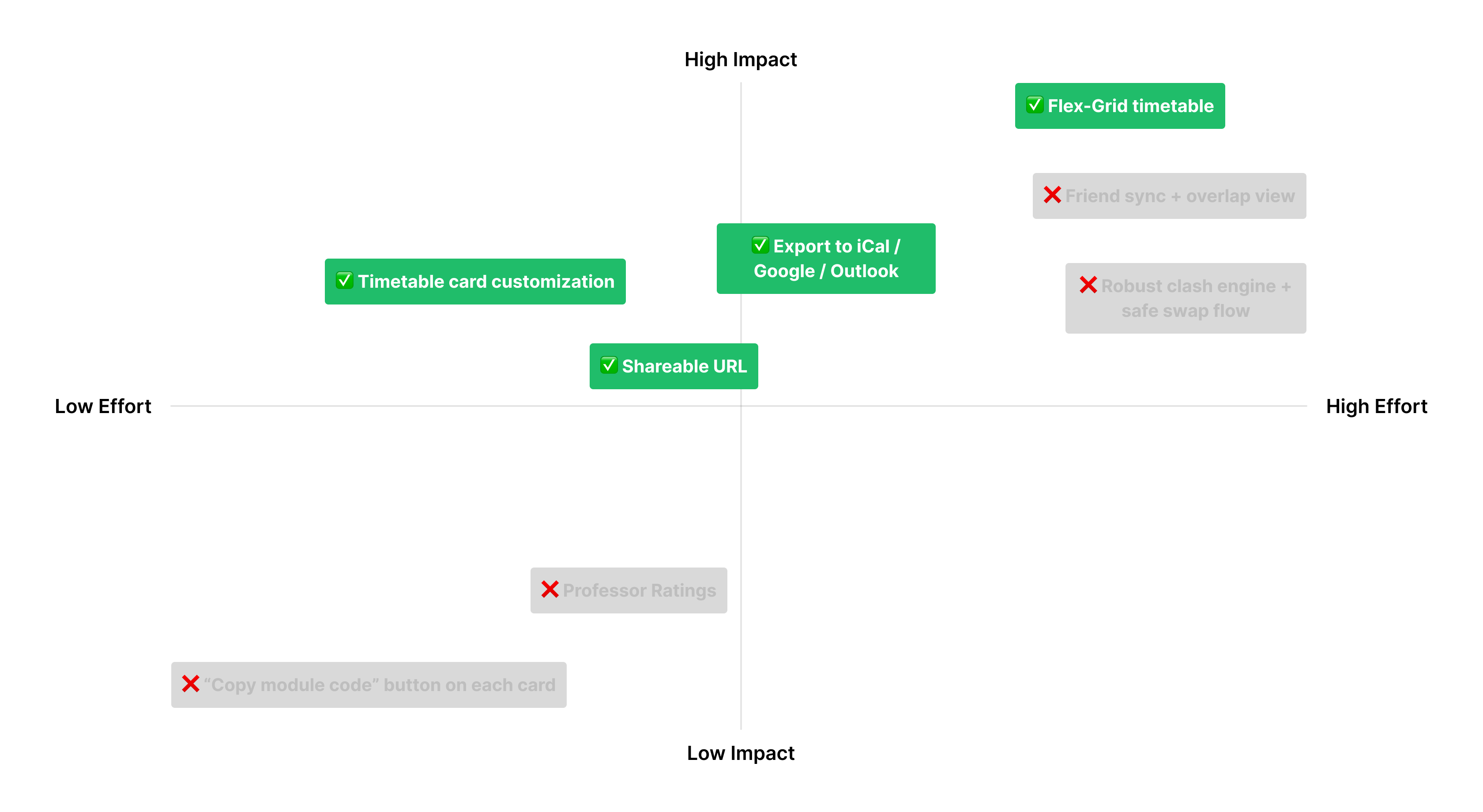
The MVP Decision
We discarded 'nice-to-haves' (like professor ratings) to focus on Utility & Flow. We committed to:
High Impact / High Effort
A 'Flex-Grid' for real-time comparison
High Impact / Low Effort
Calendar Export & Link Sharing (solving the current struggles), and Card Customization (let users choose what they want to see in their timetable details)
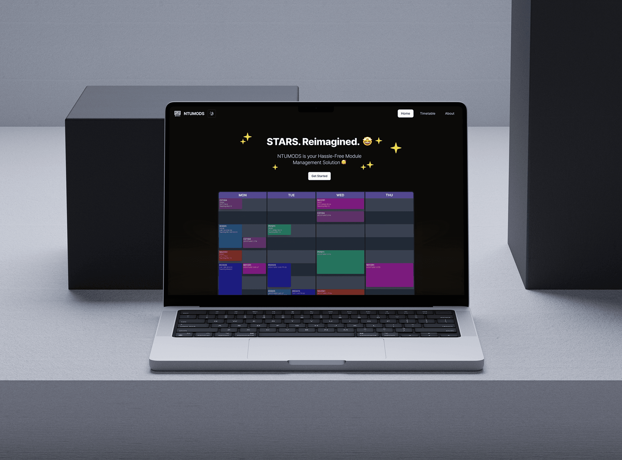
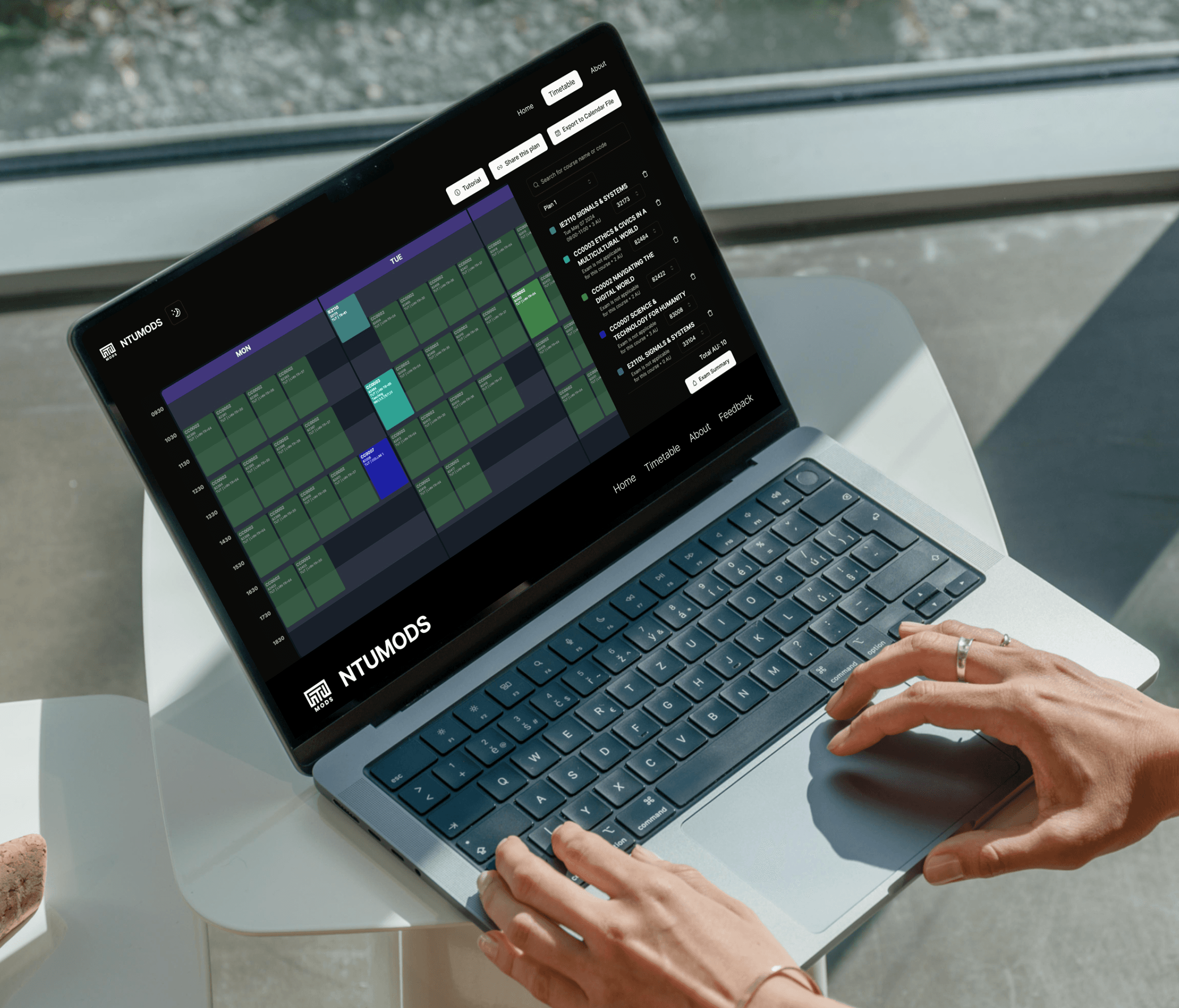
Feature #1: Flex Timetable Comparison
Students explore many index combos and need clashes to show instantly. Dropdowns hid the time impact, so I built a flex-grid that surfaces alternatives in-context for fast “what-if” planning.
Feature #2: Sharing & Calendar Export
Planning is social, then needs a real-world handoff. I designed shareable links that render the exact timetable (no screenshots) and one-tap iCal export for Google Calendar/Outlook.
Feature #3: Display Customization
Let students toggle what matters—index, venue, type, remarks—so the timetable stays scannable during long planning sessions.
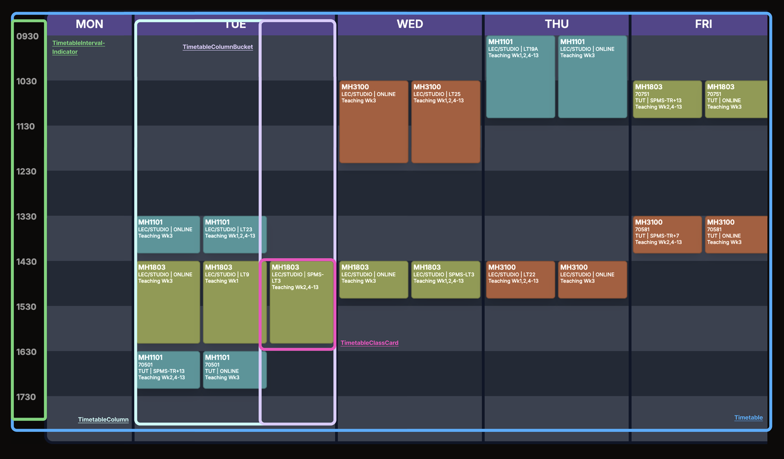
Technical Implementation
Designing the timetable was only half the job — the real challenge was implementing it in a way that keeps the experience fast, flexible, and responsive, especially when students are switching indexes to compare schedules.
The timetable is the most intricate UI in NTUMODS: it renders classes by day/time, supports seamless index switching (showing alternatives directly in context), and stays usable across screen sizes. To keep the UI scalable and maintainable, I implemented the timetable as a composable hierarchy.
Timetable
├── TimetableIntervalIndicator      ← time labels (e.g., 0800, 0900)
└── TimetableColumn (per day)
    ├── Hour Grid (layout background)
    └── TimetableColumnBucket (non-overlapping group)
        └── TimetableClassCard (individual class)
To better illustrate this, here is how I built the timetable component:
Results & Impact
1,000+
Beta Version Users
NTUMODS gained traction early, attracting over 1,000 NTU students during its beta phase.
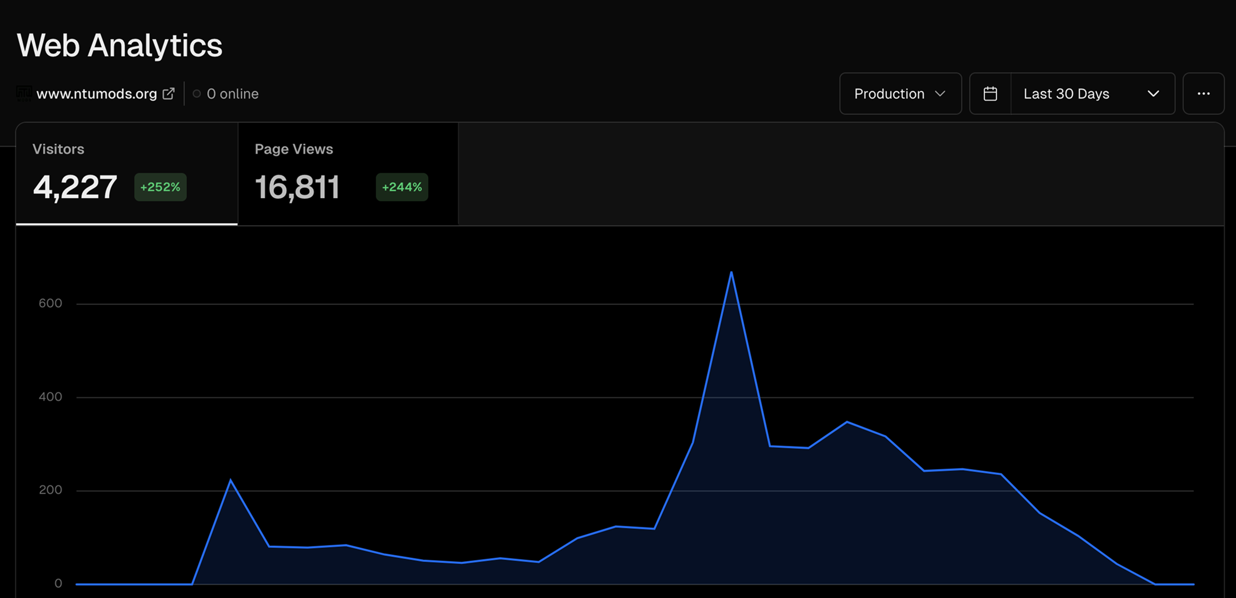
4,277
Visitors in Launch Month
In the launch month, the platform saw 4,277 visits, highlighting strong demand for a user-friendly module planning tool.
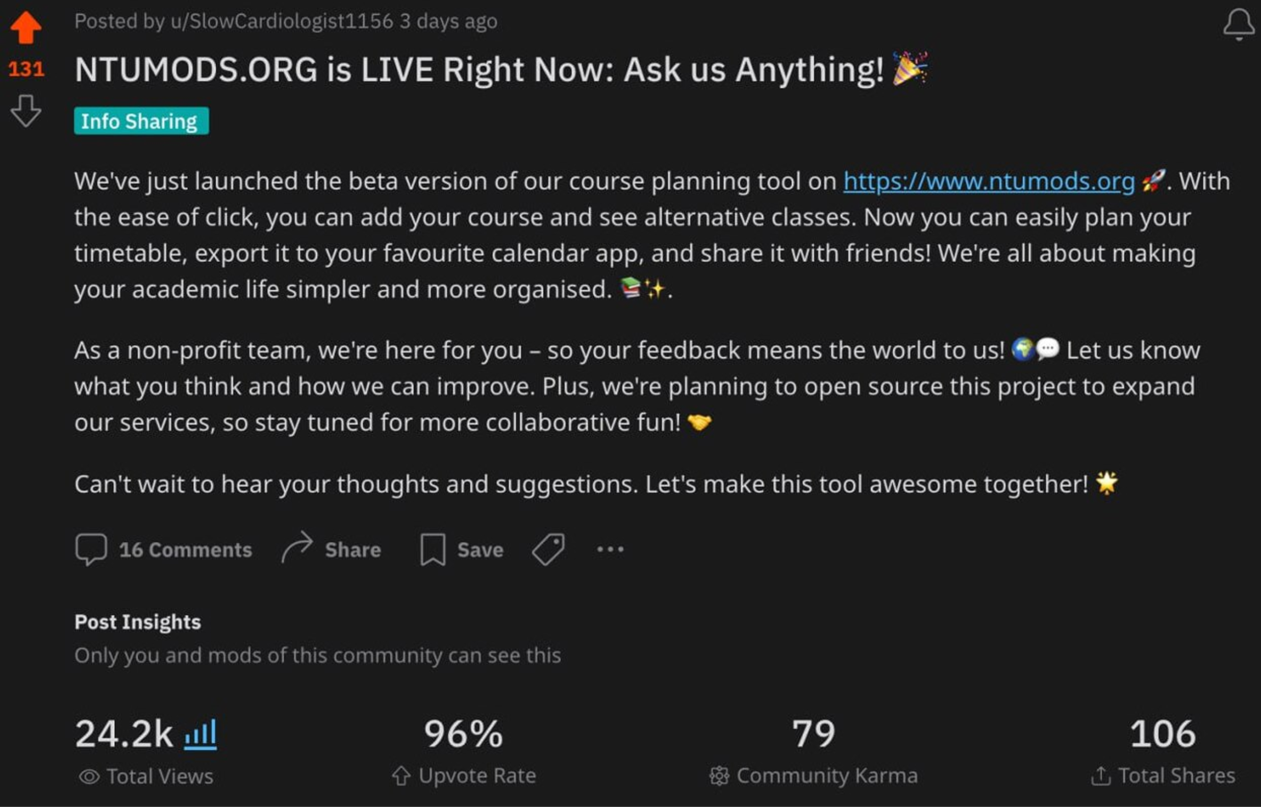
96%
Reddit Upvote Rate
A launch post on Reddit generated 24.2k views, 131 upvotes, and 106 shares—validating that the product was worth forwarding to friends.
Future Improvements
Become the default STARS planning experience
Explore a secure integration that lets students push a finalized NTUMODS timetable into NTU's official systems, so the plan doesn't stay as 'draft' — it becomes the actual registered schedule.
Friend sync and overlap view
Enable side-by-side timetable comparison and highlight common free slots to make 'jio' coordination faster than chat back-and-forth.